New year, new website. My last website was built in 2020. I’ve been meaning to update it for the past few years, but I never quite got around to it. This year, however, something changed. Part of that shift has to do with AI. But AI alone isn’t enough to spark motivation. Tools can lower friction, but they don’t create inspiration.
Inspiration
Over the past year, I’ve been watching 仙逆 (Xian Ni). It’s a xianxia story that follows a mortal’s cultivation journey toward immortality. In the world of 仙逆, cultivators pursue a 道 (Dao), a personal principle or ideal that defines their path and shapes their power. Just like how software engineers implement DAO (Data Access Object), cultivators can use their 道 to gain access to stronger powers and abilities. The main character, Wang Lin, cultivates a 道 that grants him access to a powerful scroll.
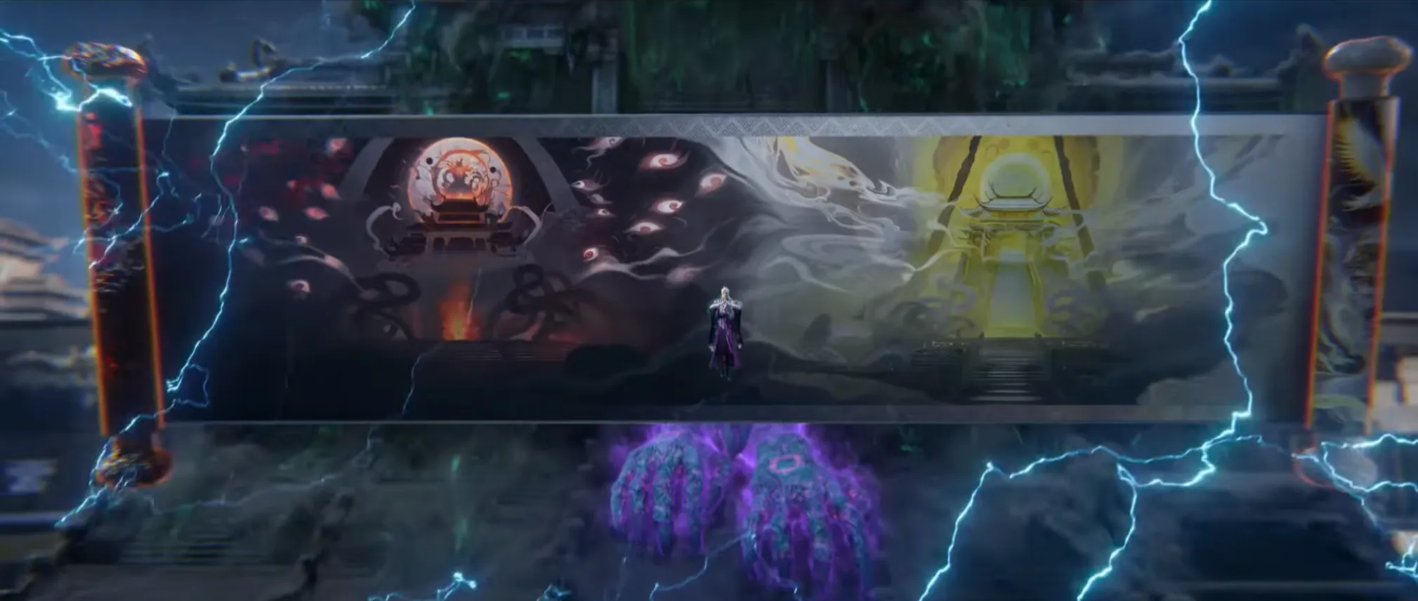
The scroll is deeply rooted in themes of black and white, balance, contrast and duality. Something about that aesthetic and symbolism resonated with me and really inspired me to try building a website that captures that same feeling.
Yin and Yang
The shadow gives the light its shape.
To know the light, dwell in the dark.
What does it mean? I honestly have no idea 😄 Both lines were generated by GPT separately and they just sounded cool. I’ve always been drawn to the concept of yin and yang. It’s represented by the Taijitu, often simply called the yin and yang symbol. Two opposing forces light and dark, passive and active. Existing not as enemies, but as complements. Each contains a part of the other. Together, they form a balanced whole. But this isn’t a philosophy post.
In many ways, this idea mirrors my experience building this new site. Finding the balance between myself and AI. I know design isn’t my strongest skill, so I leaned on AI to help shape the visual direction. But I also didn’t want AI to do everything for me. So while I used AI for inspiration and structure, I intentionally avoided copying its code directly. I chose to rebuild the site manually, line by line, because I wanted to experience the feeling of understanding something by doing it instead of copying and pasting without truly absorbing it.
To be fair, you can copy and paste code and still learn from it. If you slow down, read carefully, and experiment, you can absolutely absorb what’s happening. But it doesn’t quite compare to building something from scratch yourself, wrestling with the small decisions, making mistakes, and figuring out why things break before they finally work.
At work, I rarely get that sense of learning through struggle anymore. Since the priority is speed nowadays, we just lean on AI to resolve problems as quickly as possible. It makes us productive but it also means I don’t always get to sit with a problem long enough to fully understand it.
Rebuilding this site was my way of experiencing that struggle of learning again. I leaned on AI for design direction but I did the development myself, slowly putting it all together. What you see now is the result of striking that balance.
AI Design
As I mentioned earlier, I’ve been meaning to update my site for the longest time. The main reason I didn’t was honestly my lack of design skills. I actually started a few portfolio projects over the past few years, but none of them ever reached a stage where they felt worth showing.
Designing a website is hard. It’s one thing to have an idea for a section or a visual style, but finishing it and building on top of it until it becomes a complete, cohesive site is exponentially harder in my opinion. So when I finally felt the spark to start again, I knew I would need help on the design side if I wanted to complete the project this time.
Create a portfolio site in pure HTML/CSS/JS, with design based on black/white and yin-yang concept.
Get rid of dark and light mode. one mode is just fine. can you improve the design. i want the landing page to be half black and half white
Improve the design by adding chinese painting textures
Make it work for mobile view
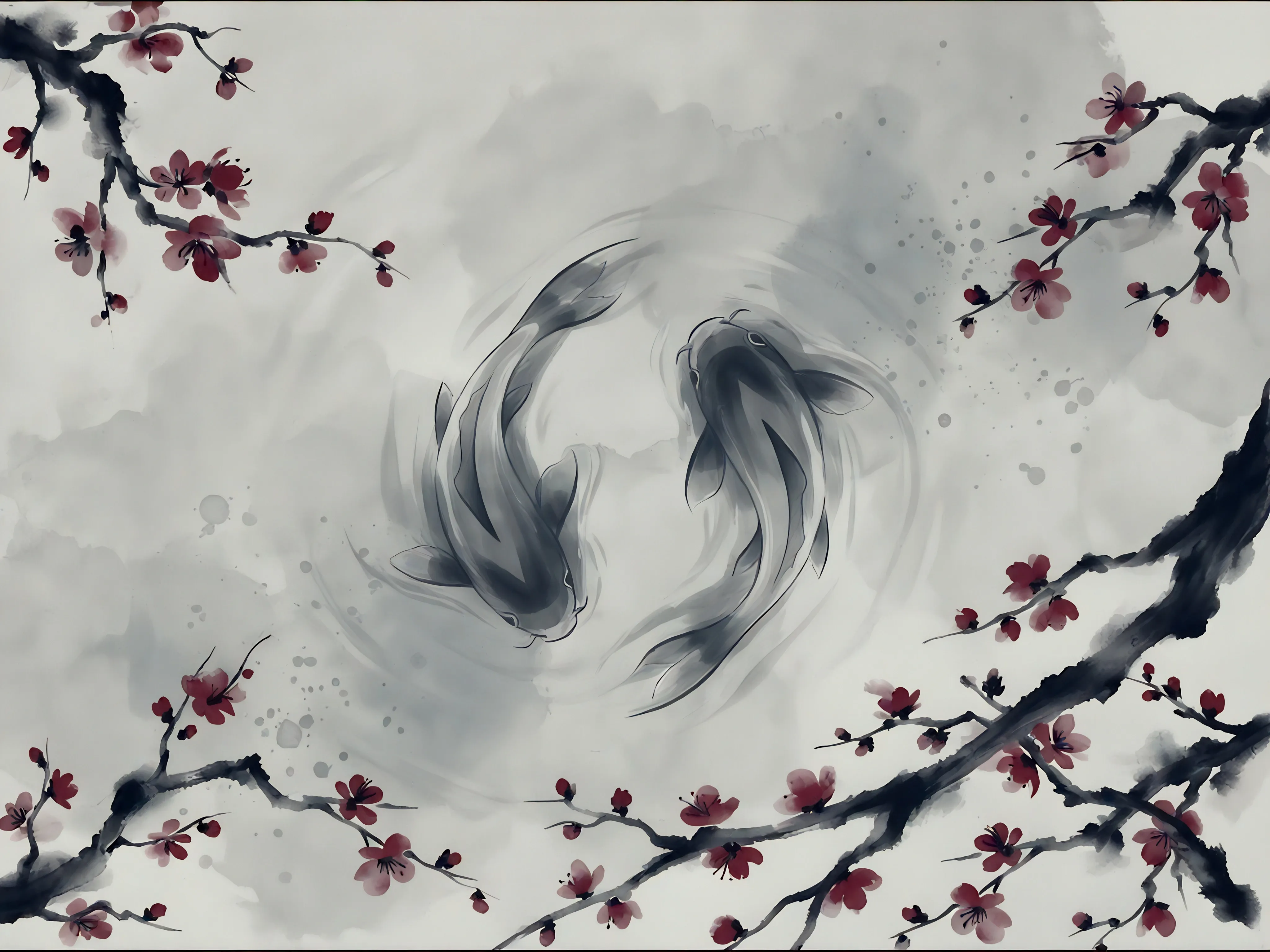
These were the primary prompts I used with Claude Code (with the frontend-design skill) to generate a base design to work with. You might be surprised by how vague these prompts are. I too was also quite surprised by how well Claude understood the direction I was going for. I wish I had recorded each iteration of the design as it evolved through prompting, but this was the main hero section that I was happy with.
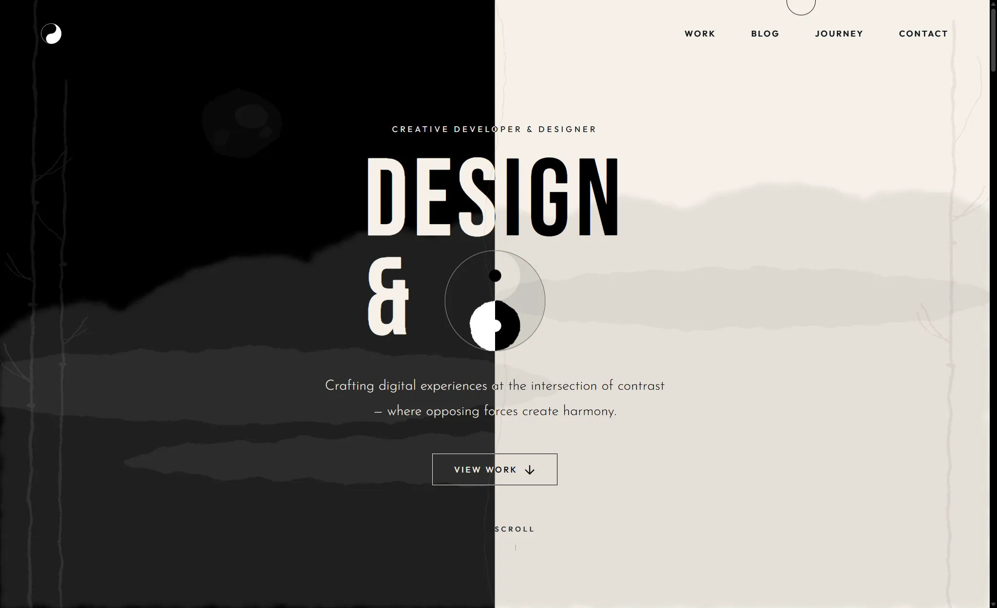
Compared to the generated design, the main changes I made were to the hero backdrop elements like the clouds and bamboo patterns as well as some fonts and smaller details such as the scroll indicator. You might also notice that Claude attempted to generate a yin-yang symbol in the center of the hero section, but it didn’t quite get the colors right. The hero text wasn’t fully visible either (The hero text was suppose to say “Design & Code”).
I also had to tell Claude to fix the mobile view quite a few times. Almost every time we iterated on different backdrop elements in the hero section, the mobile layout would break. I’d tweak the design, it would look good on desktop, then I’d check mobile and something would be off again.
So there was a bit of back and forth with the prompting. It wasn’t a one-shot generation and it definitely required iterating, guidance and oversight. The other sections of the page were built up gradually through additional prompting. Most of the layout and structure there were fairly standard, so I didn’t run into too many issues.
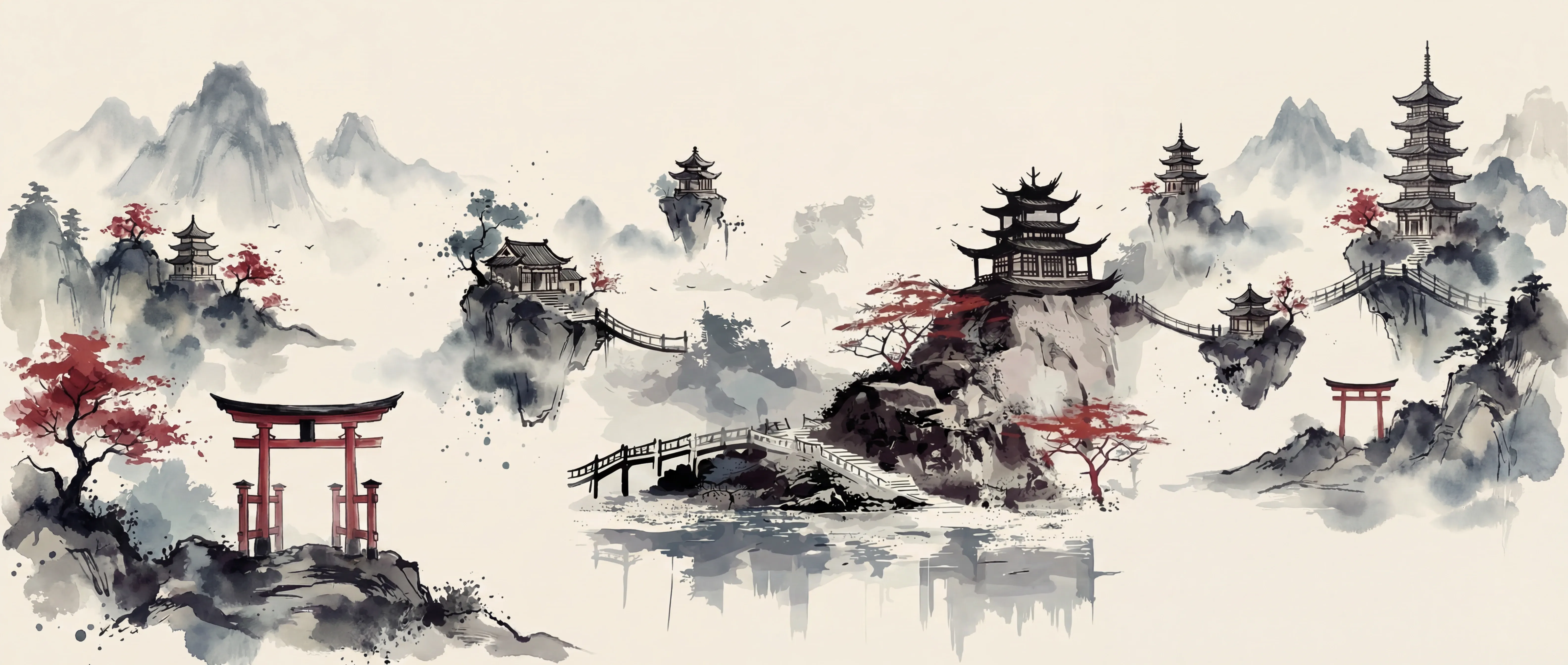
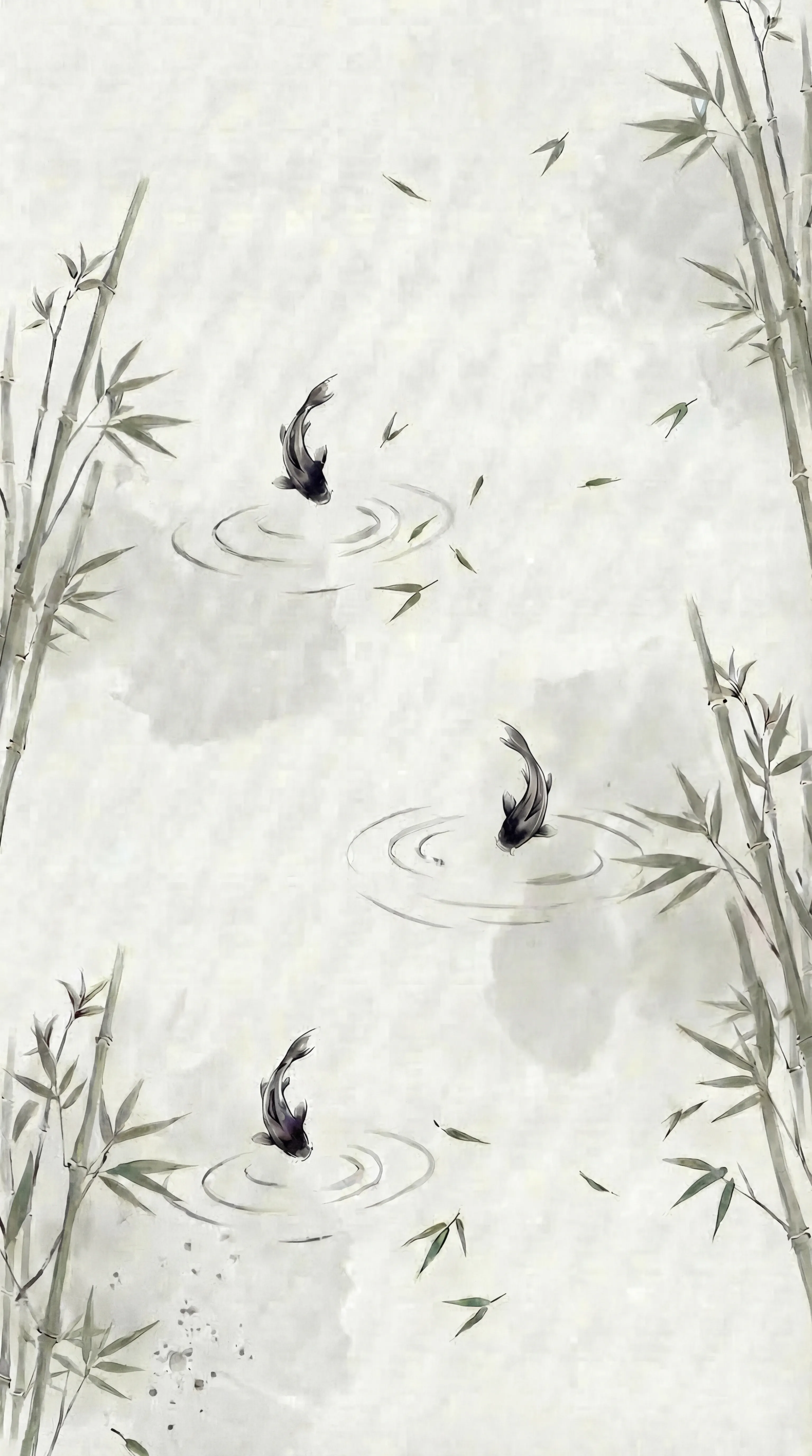
As for the different backdrops you see across the various sections, those were generated using OpenArt. I initially wanted Claude to generate SVG backdrop elements, but after seeing what it produced, I figured I’d have better luck using an image generation tool instead.
Prompting on OpenArt, however, wasn’t as straightforward as generating the website with Claude. Without very detailed specifications and solid reference images, the results could look completely different from what I had in mind. Even though my OpenArt subscription comes with a fairly generous number of generation credits, I’d say around 65% of the images I generated were either unusable or just plain slop. Some weren’t even worth editing.
After quite a bit of trial and error, these were the final images I ended up using.
AP Development
At this point, you’re probably thinking:
Yo… you basically had Claude do most of the work. Where’s the balance? Besides prompting and moving code around behind the scenes?
Which is a fair statement. Most of the real work actually went into building on top of what Claude generated and also with learning Astro along the way. Even though Claude helped generate the design, I still had to understand Astro’s way of handling components, layout, styling and the Content API.
Astro also handles rendering mostly at build time, which required me to think from a different perspective compared to the CSR SPA sites I usually deal with. Knowing what to componentize, what should go into a layout, working with global and locally scoped styling, and integrating with Astro’s content collections. All of these were not part of prompting. They came from good old documentation reading, breaking things, and figuring out how to fix them.
Building Upon Generated Code
This is where most of the work happened:
Mobile Navigation
From the start, the mobile navigation was never really working properly. Although I could fix some design issues through prompting, one thing I just couldn’t get Claude to fix properly was the mobile navigation. The elements were there in the HTML markup, but they were never visible or interactable in the browser. Quite a lot of time was spent designing and recreating that mobile navigation.
Instead of sticking with the original JavaScript toggle implementation, I upgraded it to use the native HTML dialog element. HTML dialog has been around for a while now, but I guess there’s not much AI can do when it comes to keeping up with more modern frontend practices.
This is something I often bump into with generated code. Things would work, but it’s not always aligned with newer or cleaner approaches. For backend frameworks where patterns don’t shift as aggressively, AI-generated code works fine. But frontend evolves fast. Patterns can change quickly and AI doesn’t always catch up.
Weird Layout Decisions
For some sections, Claude pieced the layout together in a slightly weird way. For example, the projects section was initially generated with the project image first, followed by the project title and description. When the image comes before the title, it feels kind of weird. The title carries more visual weight, so it almost confuses the viewer. Does the title belong to the project image above or below?
There also wasn’t a button to view the project. There was just a hover state on the image. That doesn’t work well for mobile since there is no hover. There’s no clear indication that the project is clickable. So besides just “designing”, I had to rethink hierarchy and interaction clarity.
The Placeholder Image Problem
Initially, Claude generated simple monotone image placeholders for the project images. When reviewing the design, it looked perfectly fine. Since the placeholders matched the site’s black-and-white theme, everything blended nicely. The issue only appeared when I replaced the placeholders with actual project images.
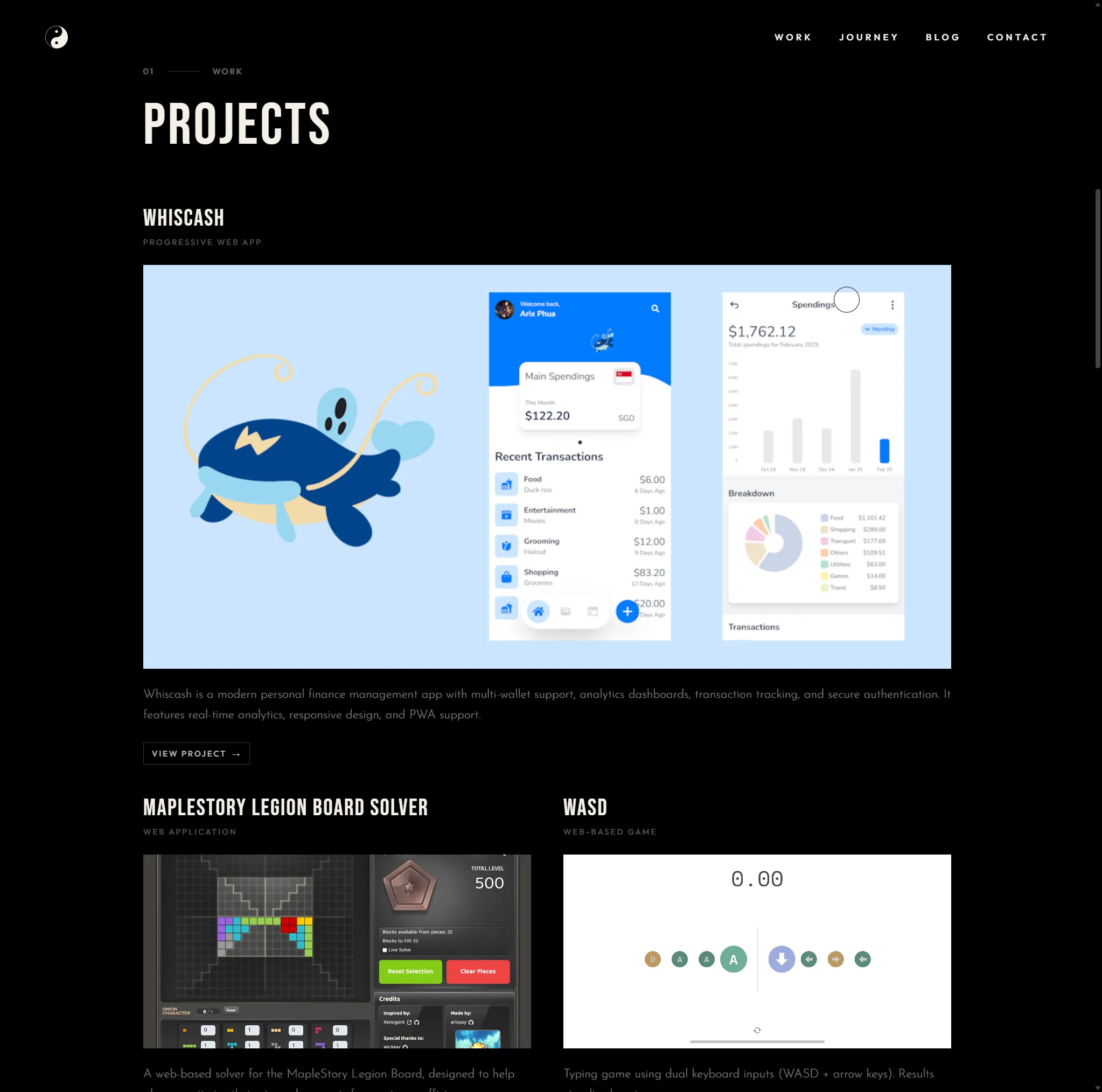
With real images, you can’t control the colors or details. My project images introduced way more color and visual noise, which strayed away from the website’s theme. This is why designing with realistic mock data matters. If you build on overly perfect placeholders, you only discover the real problems later.
My initial fix was to add a grayscale filter. Since the original placeholders were monotone, I figured converting everything to grayscale might restore the theme. But as you can see below, something still doesn’t feel right.
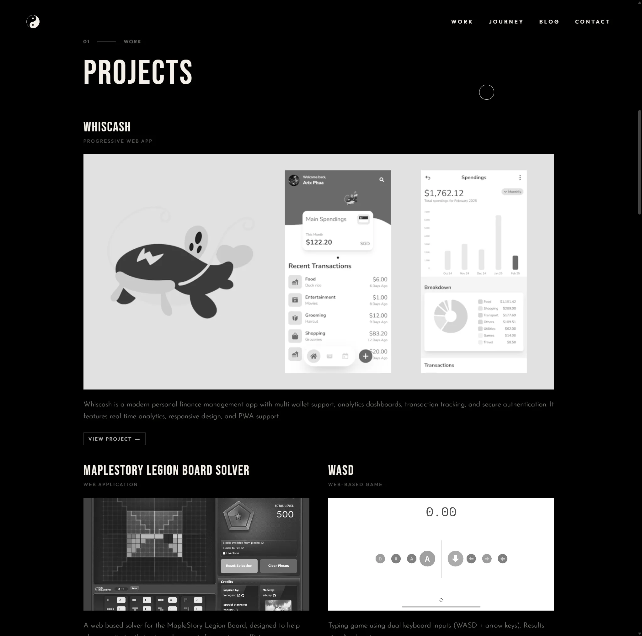
Even without color, there was still too much detail. When scrolling, it became hard to focus. There were too many elements fighting for attention. It made it harder for the reader to focus on the actual project they were trying to read.
Act Blur, Live Longer
After cracking my head over it for a bit, I finally had the idea to add blur on top of grayscale. By combining grayscale + blur, the images started looking much closer to the original placeholders and everything fell back into theme again. I then added hover transitions to slowly remove the filters when a viewer hovers over a project. Although it brought back all the random colors and details, this time it was for only a single image. That made it feel intentional instead of overwhelming.
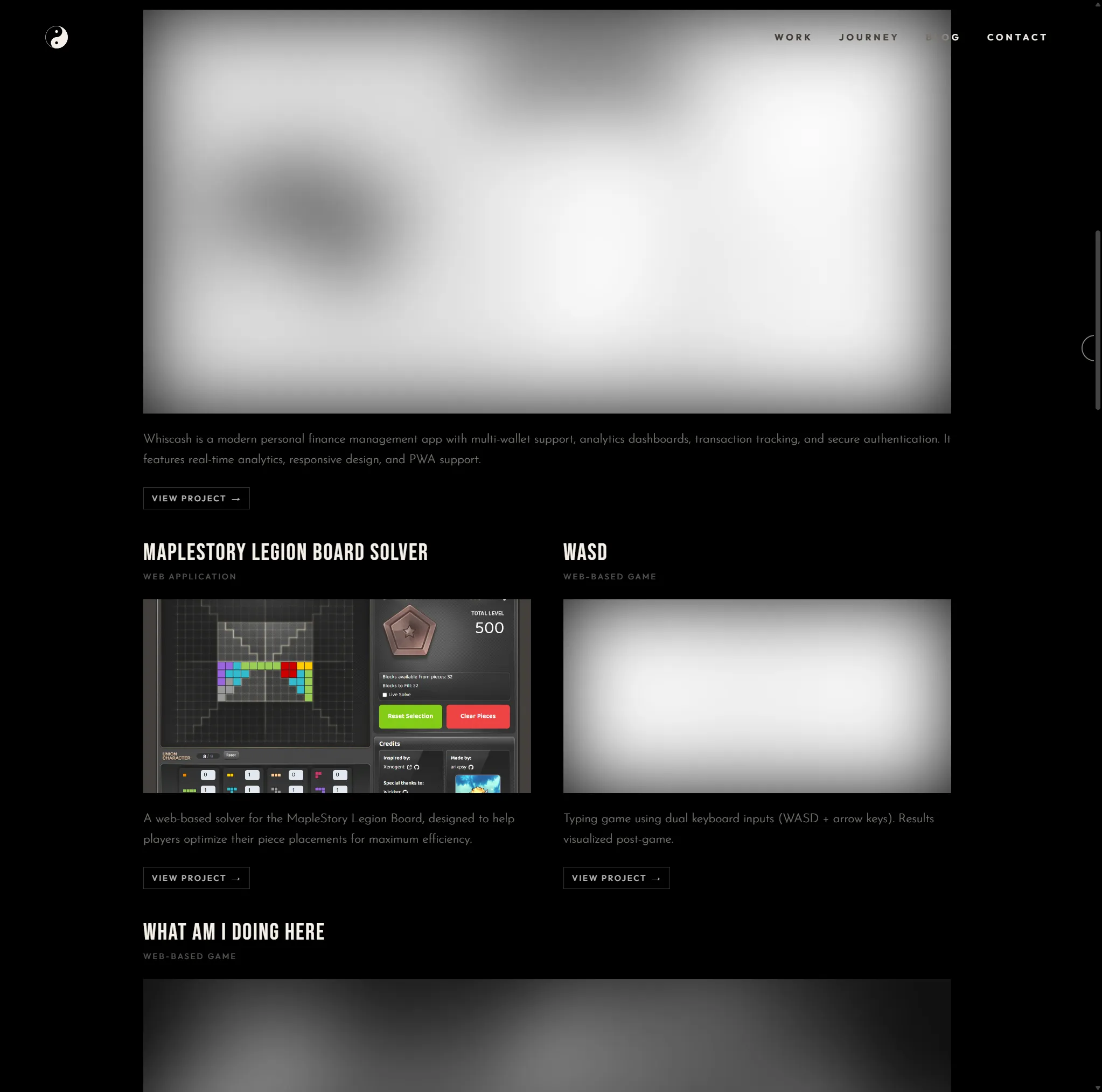
For mobile, since there’s no hover behavior, I implemented a scroll listener that detects which project element is closest to the center of the viewport. As you scroll, that project comes into focus. It creates a subtle effect, but it makes the whole section feel more deliberate.
The Result of Balance
This site is the result of balance. I was able to complete it because I relied on AI for design. Without that starting point, I probably wouldn’t have built something like this. Design has always been where I get stuck. AI helped me start. But finishing / fixing / reshaping / polishing it was all still on me. That balance is what made this project possible.
It all worked out great. But somewhere in that efficiency, I can’t help but wonder… what did I trade away?